


La Fina Identity. TOS Estudio

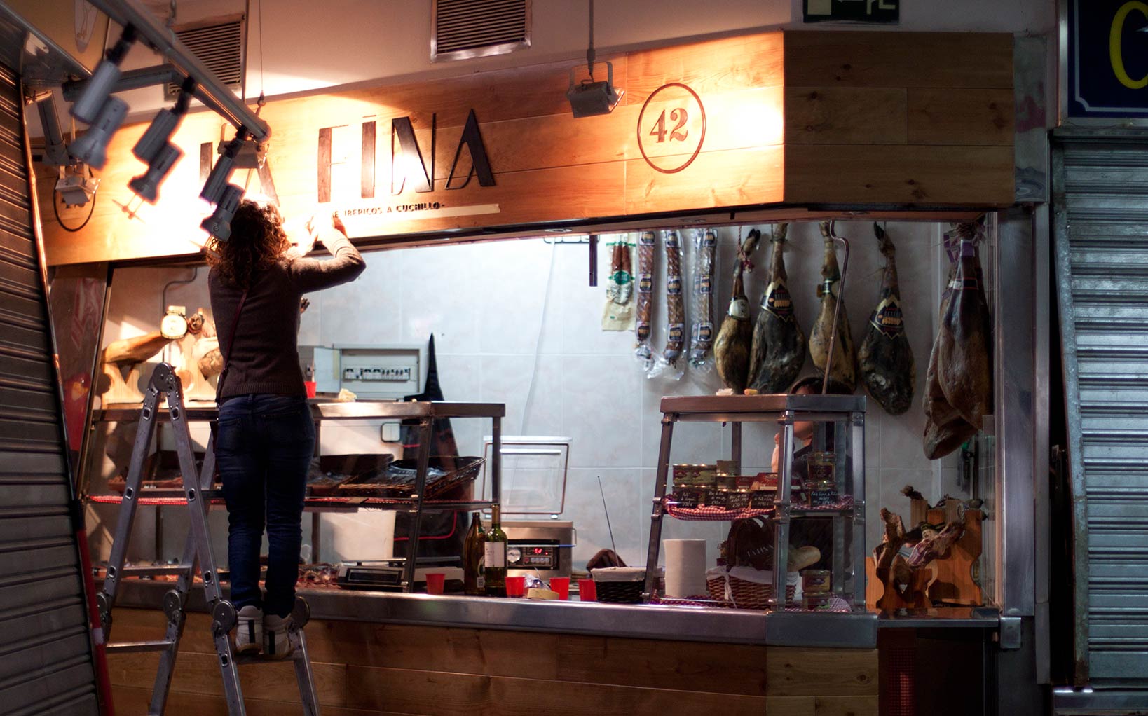
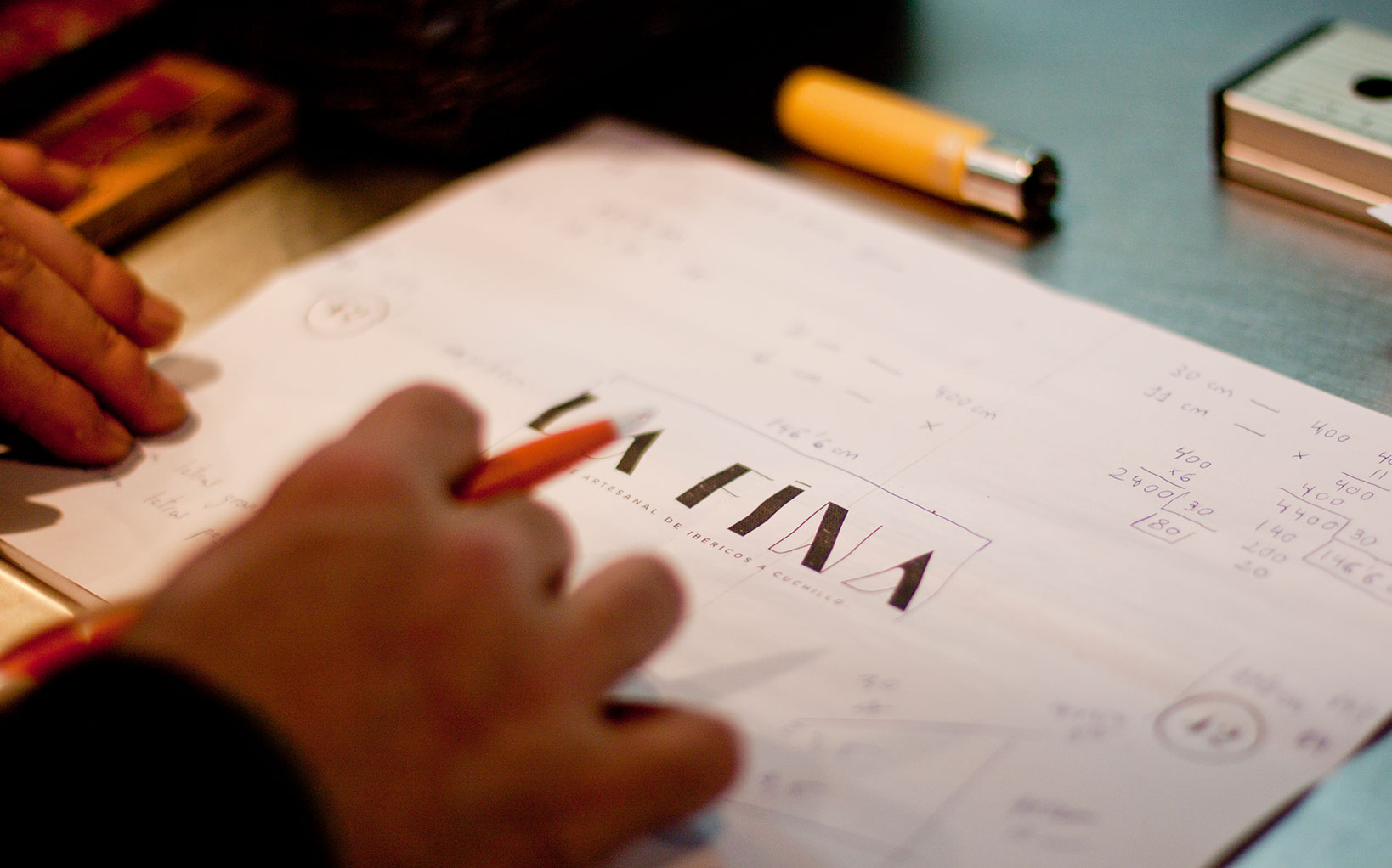
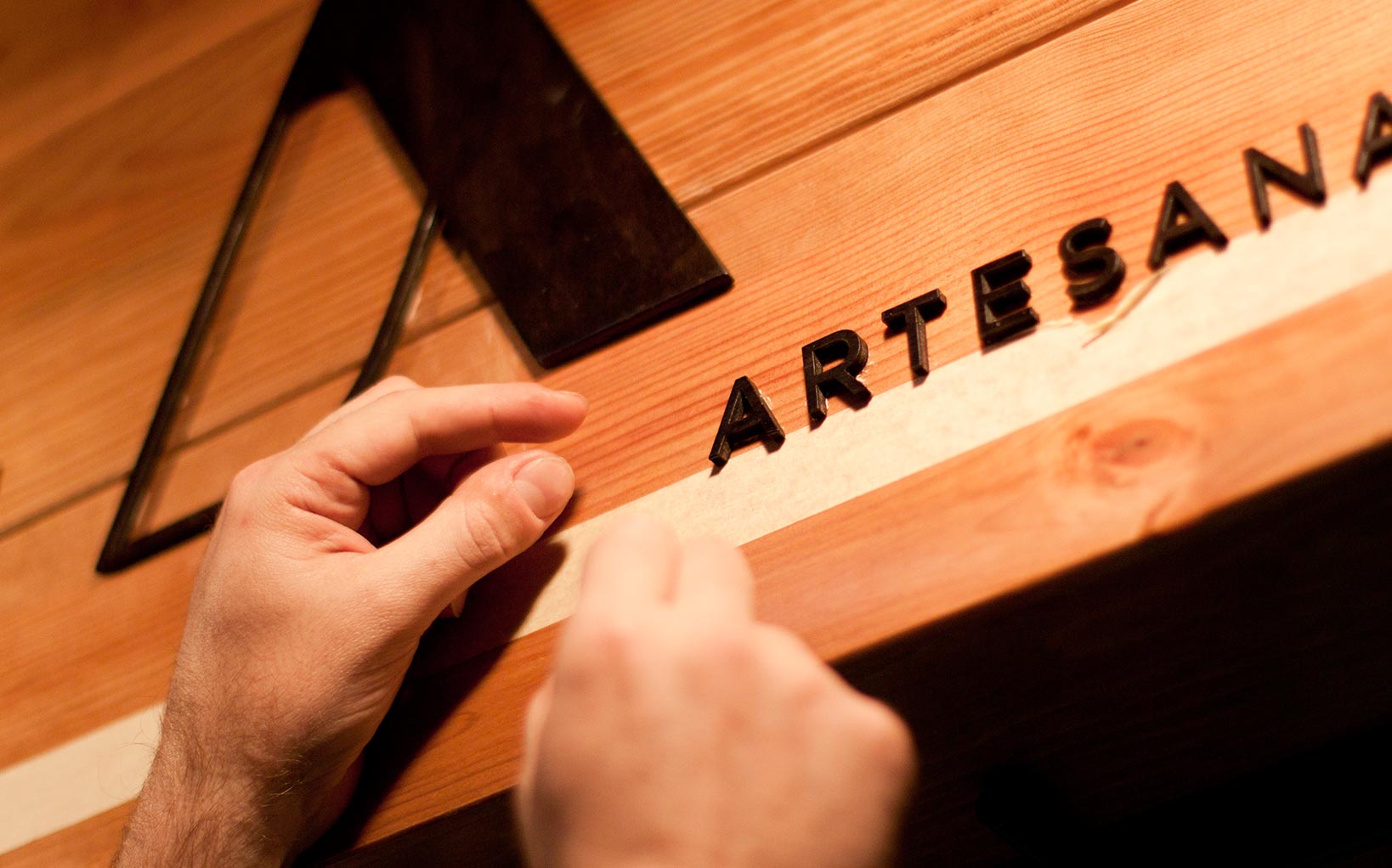
La Fina — Sign Making Of

La Fina. Shop Sign Making of
La Fina. Shop Sign Making of
La Fina. Shop Sign Making of

La Fina. Making of

La Fina. Making of
La Fina. Shop Sign Making of
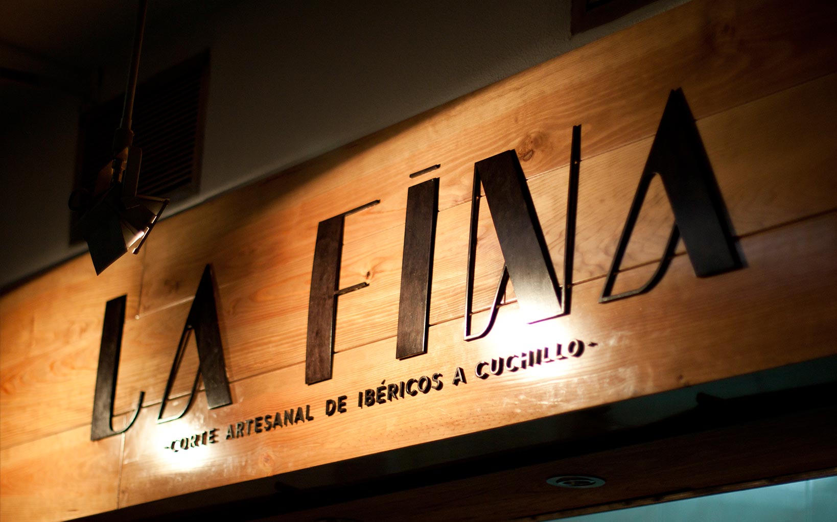
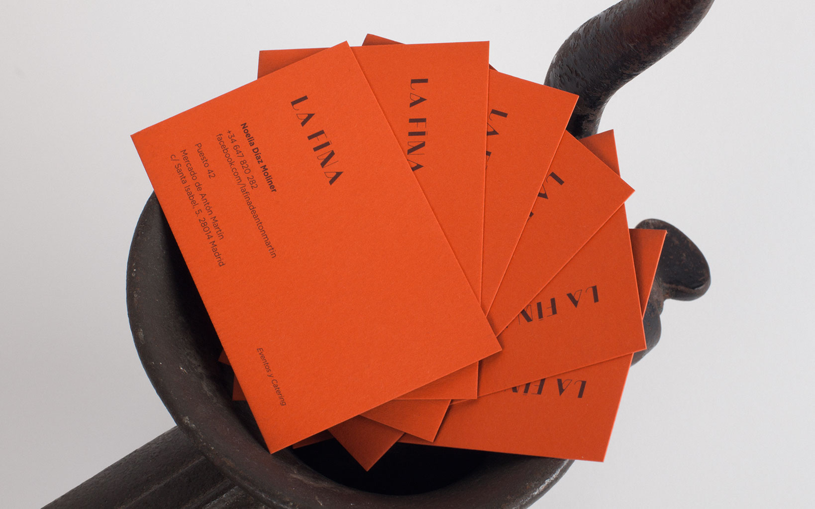
La Fina —Stall 42
02.2014
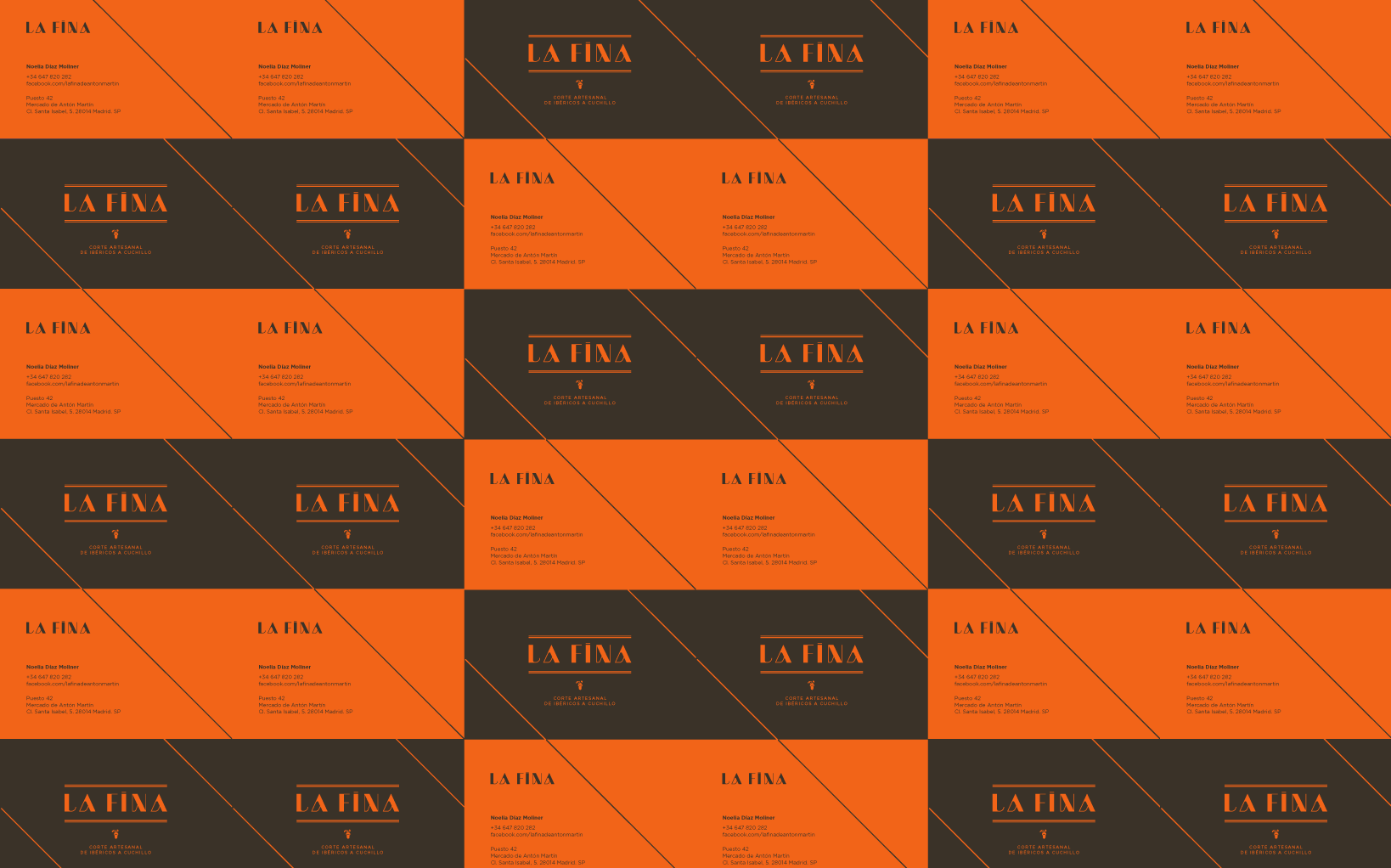
These are the tasteful projects we love to be involved in. La Fina is a cosy stall of Iberian ham and sausages inside one the most traditional markets in Madrid. Their speciality, the thinnest traditional cut by knife.
The intense Iberian ham flavour contrasts with its really thin cut, as our personal interpretation of the brand: starting with very thin lines which become much thicker as you dig in the typographical flavours. This contrast in its shape refers to the traditional Didone typographies, a premium old classic, keeping the traditional elegant aesthetic with the twist of contemporary use of the typography.
Everything is natural in La Fina, there is no E-colorants or E-preservatives, so what could be better than the wood for this brand common thread? Incorporating fluorescent colours adds the avant-garde and irreverent bit of those strong contrasts between flavours and textures – La Fina is traditional, but also contemporary and intense.
No doubt this was a real pleasure to our creativity and palette.
Concept & Design Direction × TOS
Identity Development × TOS
Graphic & Signage Prodcution × TOS
Laser Cutting × Mimétrica